A buyer scrolling a marketplace grid gives your listing photos about the same attention they give a passing bus. The first image is roughly a stamp on a phone screen, sitting next to forty others, and it has exactly one job: earn the tap. Everything else — the craftsmanship, the description you agonised over, the price you worked out properly — only matters if that first image does its job. Most sellers try to make it do four jobs at once, which is why it does none of them. The Shop Branding Kit is laid out around that division of labour.
Relisting anything this week? The Shop Branding Kit has three listing-image layouts — a hero, a feature callout page and a what's-included grid — all square-safe and editable in Slides or Canva.
 Shop Etsy Pricing Calculator Google Sheets, Handmade Profit & Margin Spreadsheet with Fee Calculator, Labour Costing & Wholesale Pricing →
The First Image Has One Job
Win the click. That is all.
Which means: the product fills the frame, the lighting is clean, and it is legible at the size of a postage stamp. Squint at your thumbnail from arm's length. If you cannot tell what it is, no buyer scrolling at speed will either — and no amount of quality further down the listing will rescue it.
The most common mistake is decoration. Props, a busy background, a lifestyle scene, three items when you are selling one. Every element you add competes with the thing you are actually selling for a slice of a very small rectangle.
Square-safe, always
Design at 2000×2000 and keep anything that matters away from the edges. Marketplaces crop differently in search results, on the product page, in the app and in recommendation carousels. An image that only works uncropped will eventually appear somewhere with its title sliced in half.
What the Other Images Are For
Each subsequent photo should remove one reason not to buy. In roughly this order:
| Image | The question it answers |
|---|---|
| 1 · Hero | What is it? (and: is it worth a tap) |
| 2 · In use or in scale | How big is it really? |
| 3 · What's included | What exactly do I get? |
| 4 · Detail / quality | Is it well made? |
| 5 · Variations | Can I get it in mine? |
| 6 · Packaging or delivery | What arrives, and how? |
Notice that scale comes second. "How big is it?" is the single most common pre-purchase question across almost every product category, and it is the one photo sellers most often omit. A hand, a mug, a ruler, a room — anything that gives the eye a reference.
Text belongs on images two to six
Not on the hero, beyond perhaps a small flash. But on the images that follow, labelled callouts do enormous work: dimensions written on the photo, a numbered list of contents, "fits A4 and US Letter". Every question you answer in an image is a question the buyer does not have to leave the page to resolve — and leaving the page is how sales are lost.
Photographing Something That Is a File
Digital products cannot be photographed, which trips people up. You show them in use instead: on a tablet screen, printed and clipped into a binder, as a flat-lay of the printed pages on a desk.
Consistency matters more than any individual image being spectacular. Ten listings shot on the same background, at the same angle, with the same accent colour, read as a shop. Ten listings each using a different downloaded mockup read as a reseller. That is the real argument for templates over one-off mockups — not that they look better, but that they look like each other.
 Shop Pinterest Pin Templates — 10 Editable Pin Designs for Google Slides & Canva: Idea-Led Layouts That Get Saved, 1000×1500, for Bloggers, Etsy Sellers & Small Business →
The Mistakes That Cost the Click
Five errors account for most underperforming first images, and all five are free to fix.
Shooting too far back. The product occupies a third of the frame with empty space around it. At thumbnail size that is a small object in a big grey square. Crop in until it is nearly touching the edges.
Mixed lighting. Daylight from a window plus a warm ceiling bulb gives you two colour temperatures and a muddy result no filter rescues. Turn the overhead light off and shoot facing the window.
Busy backgrounds. A patterned throw or a visibly domestic kitchen makes the eye work. Plain, light, uncluttered — a sheet of card costs almost nothing.
The whole range in one photo. Six colourways in the hero image means the buyer sees none of them. Show one and put the range on image five.
Text over the product. A banner across the middle of the hero hides the thing being sold, and marketplace crops often slice it mid-word anyway.
Views But No Sales
This is a diagnosable problem, not bad luck. If people are arriving and leaving, your first image is working and something after it is not.
Work through the same list. Can they tell the size? Can they see exactly what is included? Is there a detail shot that proves quality? Is there a variation they might want that you have not shown? In most listings that get traffic but no orders, at least one of those four is simply missing — and adding it is a twenty-minute job rather than a rebrand.
The opposite problem — no views at all — is not a photo problem. That is search, and no image can fix a listing nobody sees.
Photos are one half of whether a listing converts; the price is the other. Our guide to the handmade pricing formula covers working out what to charge once fees and your own time are counted, and the Etsy Pricing & Profit Calculator does the arithmetic. If you sell at fairs as well, the craft fair prep checklist covers the in-person equivalent of a good thumbnail — the table that makes people stop. And for driving traffic to the listing in the first place, the Pinterest Templates Studio uses the same square-safe thinking in a 2:3 format.
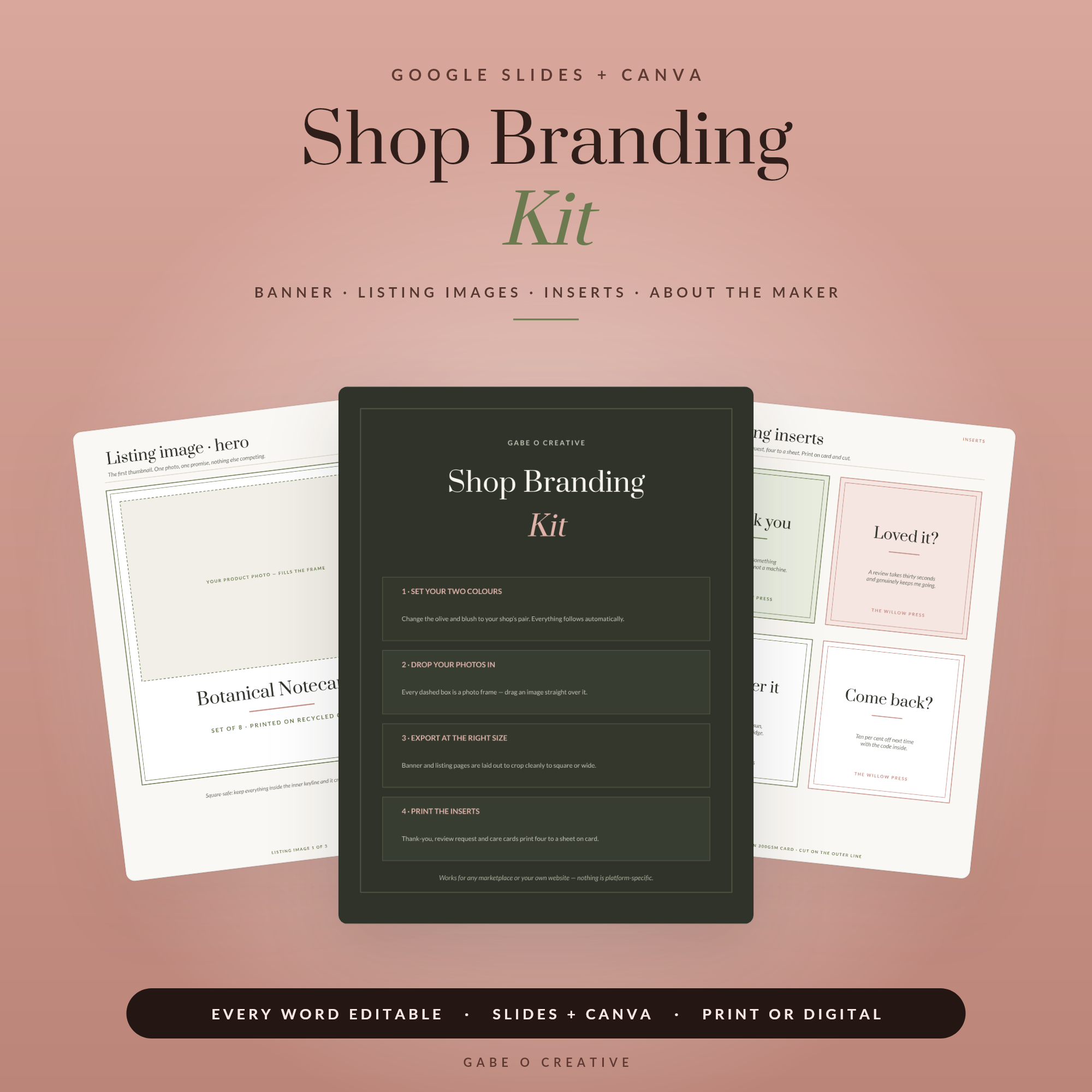 Shop Shop Branding Kit Editable Template for Google Slides & Canva, Shop Banner, Listing Image Layouts, Packaging Inserts & About the Maker Page →
Listing Photo FAQs
What should the first listing photo show?
The product, filling the frame, in a way that is legible at thumbnail size. Nothing else. The first image has one job — winning the click from a grid of competitors — and every extra element you add to it makes that job harder.
How many listing photos do I need?
Most platforms allow up to ten and most sellers benefit from using six to eight. Each should answer a different question. Ten near-identical angles is worse than five images that each remove a reason not to buy.
Should listing photos have text on them?
Not the first one, beyond perhaps a small feature flash. Later images benefit enormously from it — labelled callouts, a what's-included grid, dimensions. Text is how you answer questions without the buyer having to read the description.
What size should listing images be?
Shoot or design square, at 2000×2000 pixels, and keep anything important away from the edges. Marketplaces crop differently across search grids, product pages and mobile, and a square-safe image survives all of them.
How do I photograph a digital product?
You cannot photograph a file, so you show it in use — on a screen, printed and in a binder, or as a flat-lay of the printed pages. A mockup template does this consistently, which matters more than any single image looking impressive.
Why do my photos get views but no sales?
Usually the first image won the click but the following ones did not close it. If people are arriving and leaving, the gap is normally scale, contents or quality — they cannot tell how big it is, what they get, or how good it is.
Fix the running order first. Open the Shop Branding Kit, rebuild one listing's images in the order above, and watch what it does — or browse the full Google Slides & Canva collection.