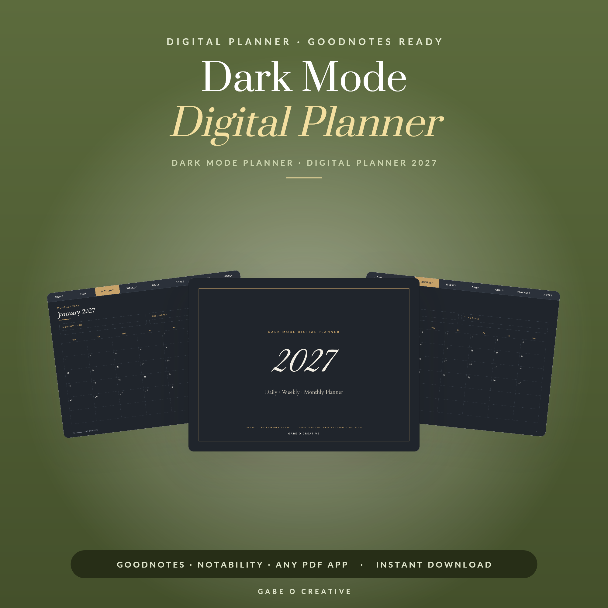
A dark mode planner sounds like a preference and is closer to a practical decision about when you plan. If you do your planning at eleven at night, a bright white page in a dark bedroom is genuinely unpleasant — and if you plan at a desk in daylight, a dark page can be harder to read rather than easier. Most people who settle on dark mode end up using both. Our dark mode digital planner is built as a dark planner rather than a light one with the colours flipped, which turns out to matter.
Planning in the evening? Try the dark planner for a week before deciding — it takes a few days to stop feeling unfamiliar.
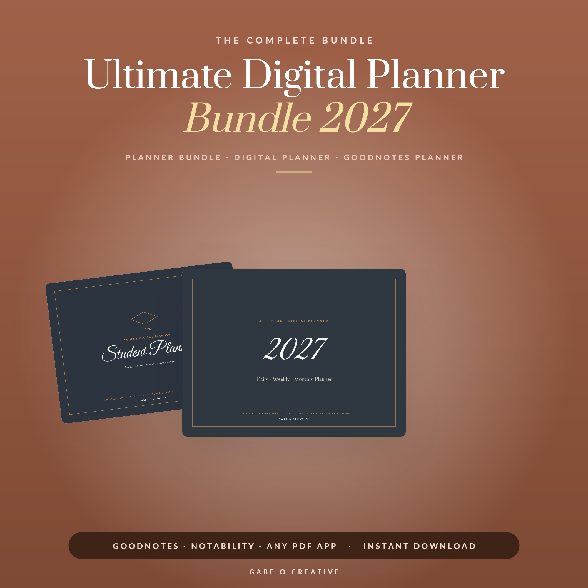 Shop Ultimate Digital Planner Bundle 2027 →
When It Genuinely Helps
Dark mode is not universally easier on the eyes. What matters is the contrast between your screen and the room around it.
- Planning at night, lights low. This is the real case. A white page at full brightness in a dark room is the digital equivalent of a torch in the face.
- In bed, next to someone asleep. Considerably less light thrown around.
- Long evening sessions. If you plan for half an hour rather than two minutes, the difference accumulates.
- You already run everything dark. Switching between a dark system and a blazing white PDF is worse than either.
And where it does not help: bright daylight, where dark backgrounds are usually harder to read; anything you intend to print; and anyone who finds light text on dark backgrounds smeary, which is a real and common effect rather than a preference.
The app theme is not the planner
Worth knowing because it catches people out: GoodNotes' dark theme changes the app, not your pages. Your planner is a PDF and keeps whatever background it was made with. Turning on dark mode and finding your planner still glowing white is not a fault — it is simply how PDFs work, and it is why a dark planner has to be designed as one.
What Actually Changes When You Write
This is the part nobody mentions until you have tried it.
| On a light planner | On a dark planner |
|---|---|
| Black and navy ink | White, pale grey, pastels |
| Highlighters read well | Highlighters often muddy — use pale pen instead |
| Stickers sit naturally | Light-background stickers float and look pasted on |
| Screenshots blend in | Screenshots blaze out of the page |
Set up two or three light pens once and stop fiddling. White for most writing, a pale accent for anything important, and a mid grey for notes you want to recede. That is the whole system, and it is the single adjustment that makes dark planning feel deliberate rather than awkward.
Stickers and screenshots
Digital stickers are usually drawn for light backgrounds, so a white-bordered sticker on a charcoal page looks stuck on rather than placed. Transparent PNGs solve it. Screenshots are the harder problem and there is no elegant fix — they will be bright. Cropping tightly helps; accepting it is easier.
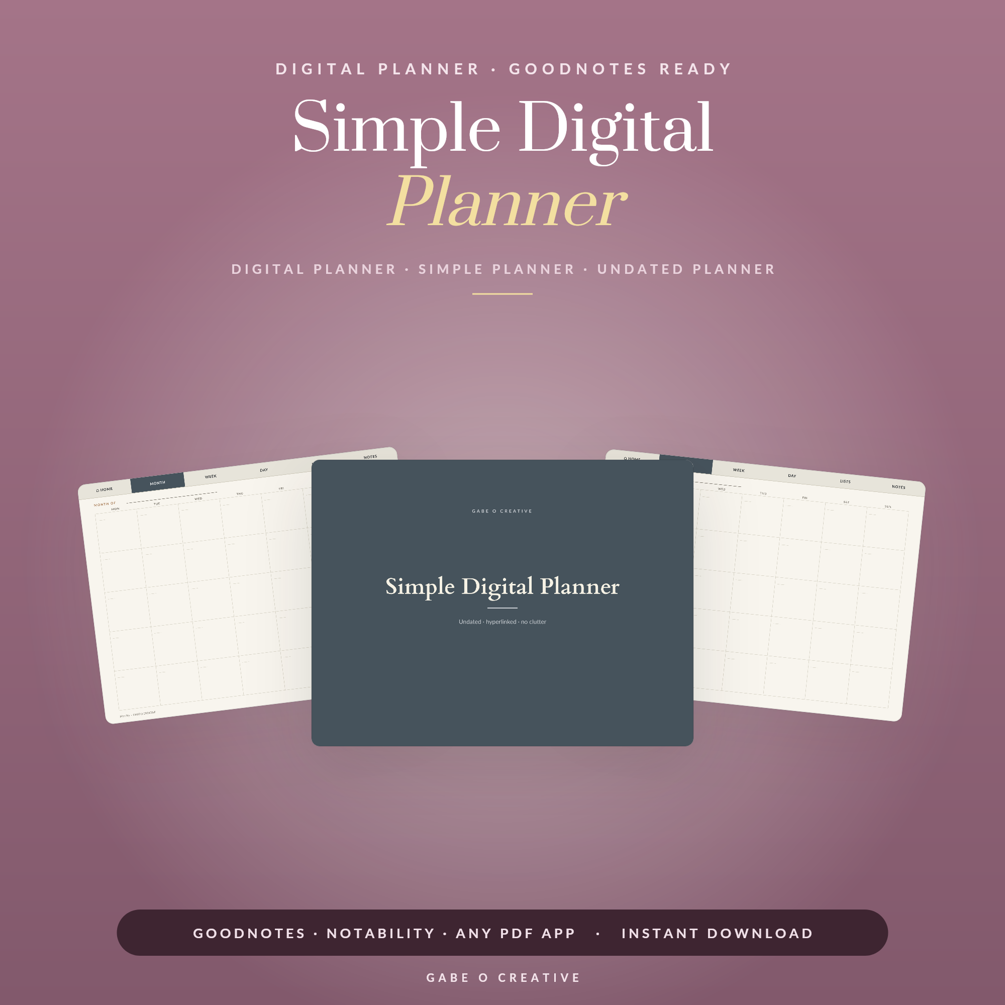 Shop Simple Digital Planner (Undated) →
Hyperlinks Still Work — But Look For Them
The links in a hyperlinked planner are part of the PDF and are entirely unaffected by colour. What changes is visibility: a light planner can mark tabs with subtle grey shading, and that same shading on a dark background can be almost invisible.
So when choosing a dark planner, look at how the tabs are marked. Clear outlines or filled shapes are what you want, not faint tonal differences. And if tapping a tab draws a line instead of jumping, that is the usual read-only-mode confusion rather than anything to do with dark mode — our GoodNotes planner guide covers that properly, along with importing and backups.
Choosing One
- Genuinely dark, not inverted. An inverted light planner has grey boxes where white ones were and reads as a mistake. A designed dark planner uses depth rather than inversion.
- Not pure black. Deep charcoal is easier to look at than #000000 and makes white ink less glaring.
- Check it is hyperlinked and dated the year you want. Dark mode is a finish, not a feature — the planner still has to be good.
- Consider getting both. Most bundles include a light and dark version, which is the sensible answer for anyone who plans at a desk in the morning and in bed at night.
The 2027 digital planner bundle includes a dark version alongside the standard ones, which is the least fiddly way to have both. If you want something plainer, the simple digital planner and the dated 2027 planner cover the light side, and the wellness planner is the one people most often use in the evening — which is precisely when dark mode earns its place.
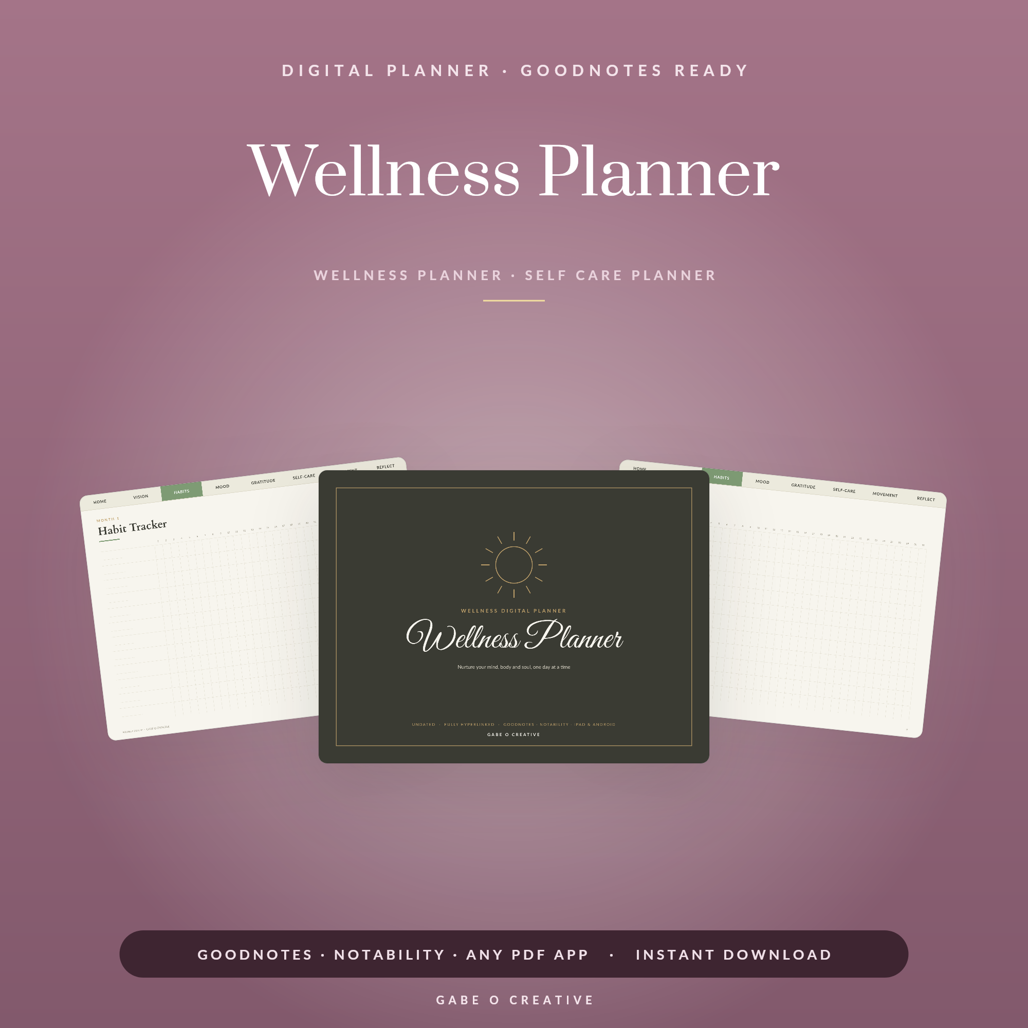 Shop Wellness Planner →
Making It Comfortable, Not Just Dark
Two settings do more for comfort than the planner itself, and both are on the tablet rather than in the file.
Turn the brightness down further than feels right. The instinct with a dark page is to leave brightness where it was, but a dark planner at full brightness is still a bright rectangle in a dark room. Most people end up around a third, which looks alarming in the shop and is correct at eleven at night.
Use the warm colour shift after sunset. Night Shift on iPad, or the equivalent elsewhere. It takes the blue edge off white ink, which is the part that reads as harsh. Dark mode plus warm shift is noticeably more restful than either alone.
Beyond that, the thing that determines comfort is contrast rather than darkness. Pure white ink on pure black is the harshest combination available — a soft off-white on deep charcoal is easier to look at for half an hour, which is why well-designed dark planners rarely use either extreme.
If it still feels wrong after a week
Some people simply find light text on dark backgrounds smeary or tiring, and that is a genuine perceptual difference rather than a failure to adapt. If a week in it still feels like effort, use a light planner with the brightness down and the warm shift on — you will get most of the evening benefit without fighting your own eyes.
Dark Mode Planner FAQs
Is a dark mode planner better for your eyes?
In a dark room, generally yes — a bright white page in a dim bedroom is genuinely uncomfortable. In daylight the opposite is usually true, because dark backgrounds can be harder to read in bright conditions.
Does GoodNotes have a dark mode for planners?
GoodNotes has a dark app theme, but that changes the interface, not your planner pages. A PDF planner keeps whatever background it was designed with — so a genuinely dark planner has to be built that way.
What pen colours work on a dark planner?
White, pale grey and pastels. Black and navy disappear entirely, and mid-tone colours look muddy. Most people set up two or three light pens once and stop thinking about it.
Do hyperlinks still work in a dark planner?
Yes — the links are part of the PDF and are unaffected by colour. What changes is that link areas are often harder to see, so a well-made dark planner marks its tabs clearly rather than relying on subtle shading.
Can I print a dark mode planner?
You can, but you should not — it uses an enormous amount of ink and reads poorly on paper. Dark planners are for screens; use a light version if you want to print.
Should I use dark mode all the time?
Most people who like it use it in the evening and a light planner during the day. Having both is not indulgent — they suit genuinely different conditions.
Try it for a week. The dark mode digital planner is built for screens, or browse the full Digital Planners collection.