A gallery wall goes wrong on the wall and gets fixed on the floor. Almost every arrangement that ends up looking accidental was arranged by hanging the first frame and then working outwards, deciding each position with a drill already in hand. Do the deciding first — on the floor, or in paper on the wall — and the same prints in the same frames read completely differently. Gallery wall layout is a planning job, not a hanging job, and printable art makes it easier because you choose the sizes after you have chosen the shape. Our printable wall art collection is designed to be printed at whatever size the layout asks for.
Planning a wall this weekend? Prints like Breathe and Inhale Exhale download instantly and print at any size, so you can size them to the layout instead of the other way round.
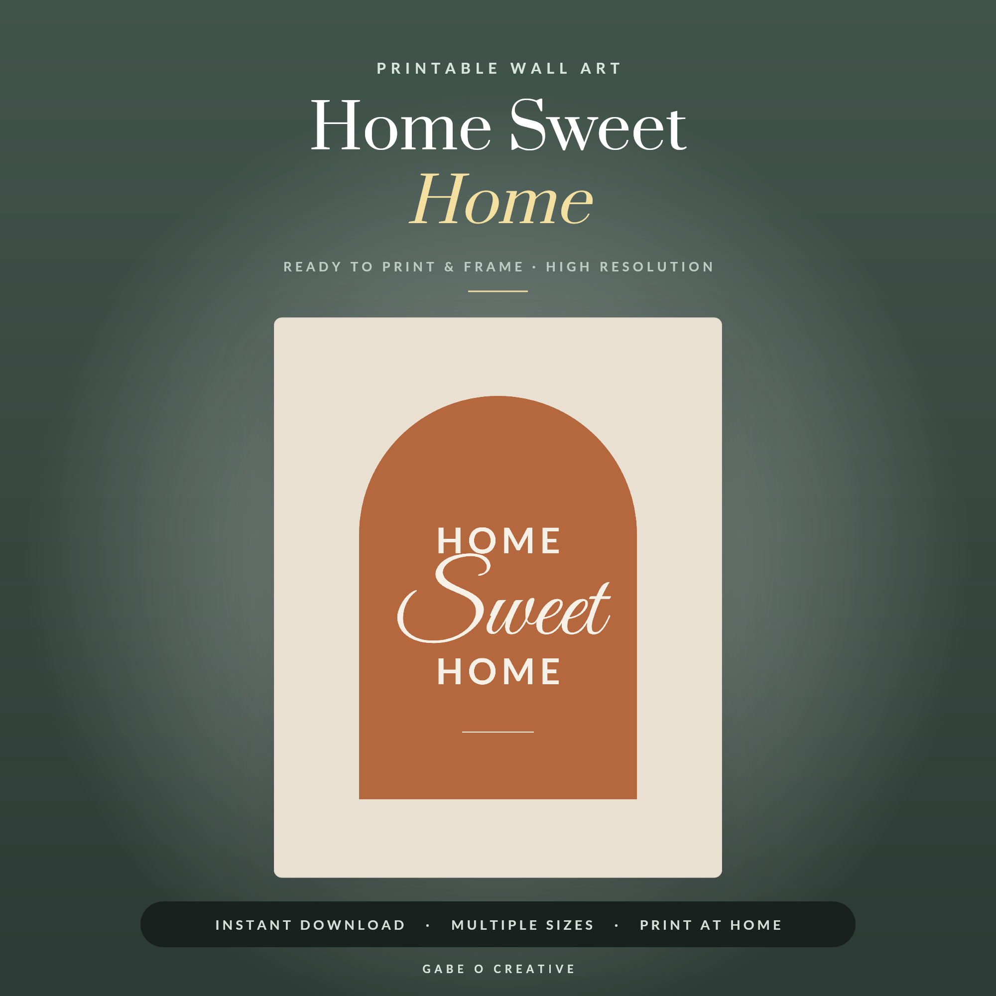 Shop Home Sweet Home →
The Four Layouts That Work
Nearly every successful gallery wall is a version of one of four shapes. Pick one before you pick prints.
| Layout | Best for | Watch out for |
|---|---|---|
| Grid | Matching frames, same-size prints, calm rooms | Any error in spacing is instantly visible |
| Two rows, aligned | Above a sofa or sideboard; mixed sizes | Keep the outer edges of the block straight |
| Salon / organic cluster | Odd numbers, varied sizes, lived-in rooms | Needs one anchor piece or it drifts |
| Single line | Hallways, stairs, narrow walls | Centre line must be dead level along its length |
The grid is the most forgiving to design and the least forgiving to hang. The organic cluster is the opposite — hard to plan, very tolerant of imprecision, and the one that suits most real rooms. If you are unsure, start with two aligned rows: it handles mixed sizes and still gives you a clean rectangle overall.
Every cluster needs an anchor
Choose the largest print, place it slightly off-centre, and build around it. Without an anchor a cluster has no visual starting point and the eye reads it as scattered rather than composed. The anchor does not have to be central, but it does have to be obviously the biggest.
The Two Measurements That Matter
Height and gap. Get these right and almost anything else is a matter of taste.
Height: centre the arrangement — the whole group, not one frame — at around 145cm from the floor. That is roughly adult eye level and the standard galleries hang to. The single commonest mistake in a home is hanging too high, usually because people work from the picture rail or the ceiling rather than from the floor.
Gap: five to eight centimetres between frames, and the same everywhere. The exact figure matters far less than the consistency of it. An even 7cm throughout looks intentional; gaps that wander between 4cm and 10cm look like an accident, however good the prints.
Above furniture
When the wall sits above a sofa, sideboard or bed, the furniture governs rather than the room. Leave 15 to 25cm between the top of the furniture and the bottom of the lowest frame — closer than feels natural. A wide gap visually detaches the art from the furniture and both look adrift. Aim for the group to span about two thirds of the furniture's width.
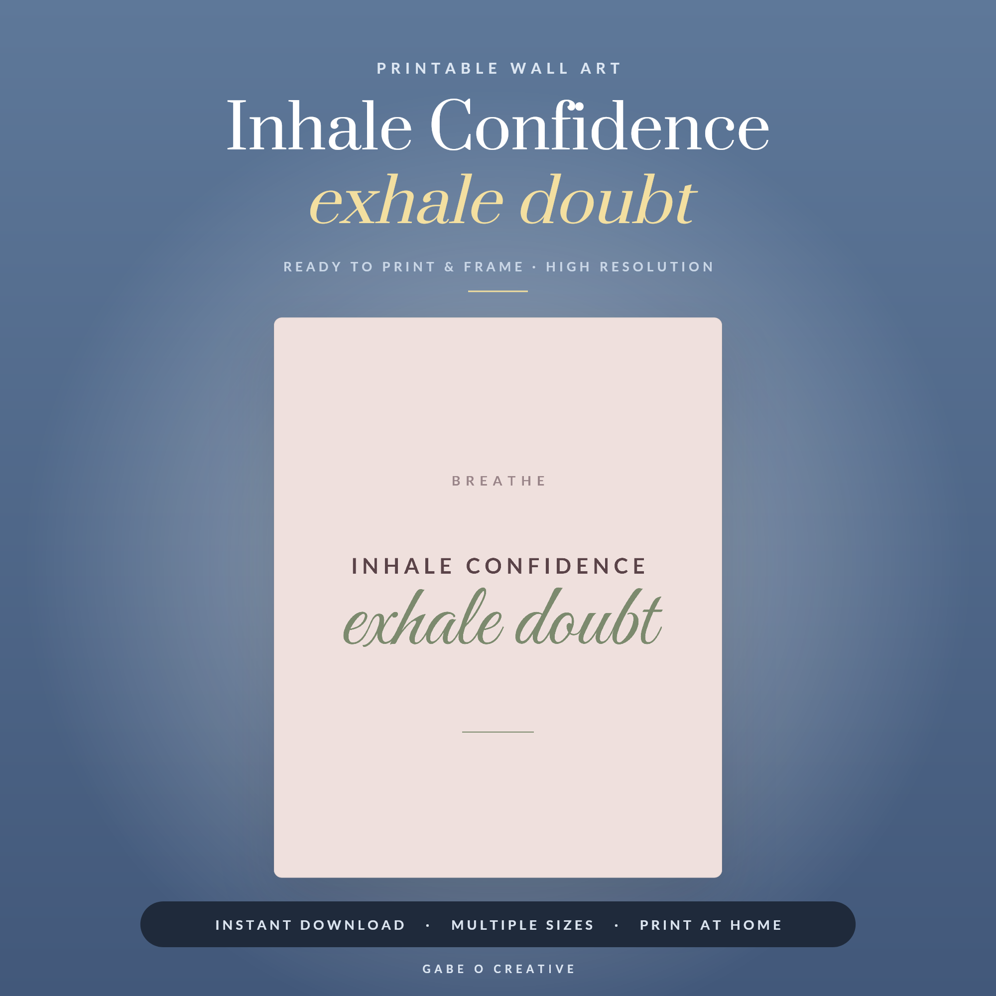 Shop Inhale Confidence exhale doubt →
Plan It in Paper First
This is the step people skip and the step that decides the outcome.
Cut newspaper or cheap paper to the exact outer size of each frame, and tape them to the wall with masking tape. Move them until the shape looks right. Then leave them there — a day, ideally two, so you see the arrangement in morning light, in lamplight, and out of the corner of your eye while doing something else. Almost every layout gets adjusted at least once during that period, and adjusting paper costs nothing.
Mark the hanging point on each paper template before you take it down, then drill through the mark. The frame lands exactly where the paper was.
Or lay it out on the floor
The floor version is faster and useful for clusters: arrange the actual frames on the carpet in front of the wall, photograph it from directly above, and use the photo as your reference. It is less accurate than paper on the wall for spacing, but far better than deciding as you go.
Choosing the Prints Themselves
A gallery wall needs one thing holding it together, not five. That thread can be palette, subject, or treatment — muted tones throughout, all typography, all line drawings, all the same two accent colours. What it cannot be is nothing at all.
The easiest version for most rooms is a limited palette with varied subjects. Prints like Home Sweet Home sit comfortably alongside quieter pieces because the palette does the unifying work while the subjects stay different enough to be interesting.
Resist filling every gap. Negative space around the group is part of the composition, and a wall crowded edge to edge reads as storage rather than display. If a wall genuinely needs more, the answer is usually one larger piece, not three more small ones.
For more on choosing what goes in the frames in the first place, our guide to printable wall art quotes covers the typography side and how to keep a set of quote prints from competing with each other.
Mounts do more than frames
A white mount board around the print is the cheapest upgrade available and the one most people leave out. It gives the artwork breathing room inside the frame, makes an A4 print occupy the visual weight of something considerably larger, and — usefully for a gallery wall — lets you use different print sizes inside identically sized frames. Two 40×50cm frames holding an A4 and an A3 print, both mounted, will read as a matched pair.
Generous is better than tight. A mount of 5cm or more looks considered; a narrow one looks like it came free with the frame. If you are buying frames anyway, buying them mounted costs very little more and does more for the finished wall than spending the same money on better prints.
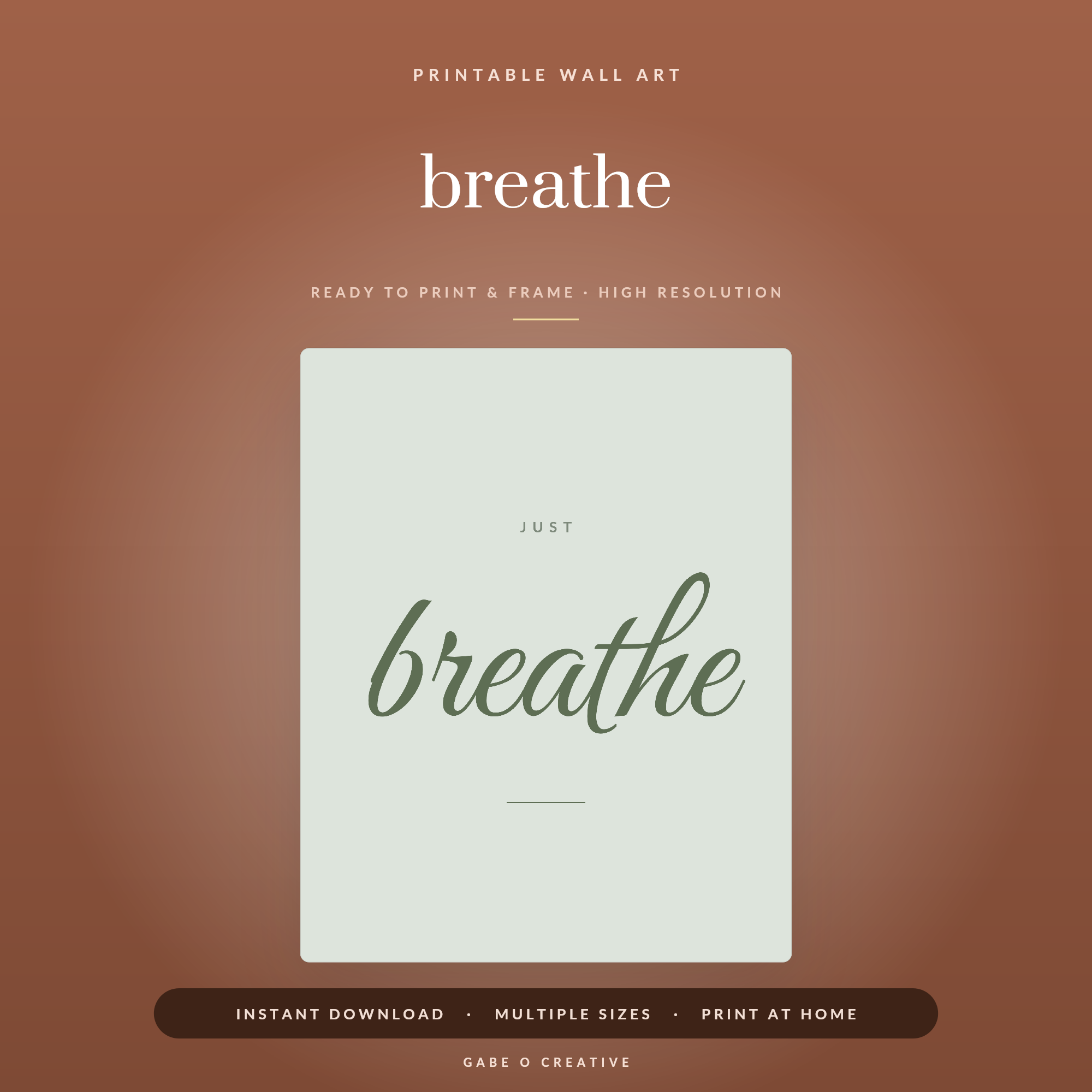 Shop breathe →
Gallery Wall FAQs
How high should a gallery wall be hung?
Centre the whole arrangement at about 145cm from the floor — roughly eye level for most adults, and the height galleries use. That is the centre of the group, not of any single frame. Above furniture, keep 15 to 25cm between the top of the sofa or sideboard and the bottom of the lowest frame.
How much space should be between frames?
Five to eight centimetres, and the same gap everywhere. Consistency does more work than the exact number — an even 7cm reads as deliberate, while gaps varying between 4 and 10cm read as accidental no matter how good the prints are.
Can I mix frame sizes and colours?
Mix sizes freely — it is what stops a wall looking like a showroom. Mixing colours needs a reason: two finishes repeated deliberately across the arrangement works, five different ones do not. If in doubt, keep frames uniform and let the art vary.
How do I plan the layout before drilling?
Cut paper templates to the frame sizes and tape them to the wall with masking tape. Live with them for a day or two, move them, then hang exactly where the paper ended up. It costs nothing and it is the single step that separates a good gallery wall from a wall of filled holes.
How many prints do I need?
Odd numbers are easier to balance for organic arrangements — three, five, seven. Grids are the exception and want even numbers. More important than the count is that the group's overall footprint covers roughly two thirds of the furniture beneath it.
What size should I print for a gallery wall?
Mix A4 and A3 for most walls, with one larger piece if the wall is big enough to carry it. Printable art can be output at whatever size the file supports, so decide the layout first and print to fit it rather than arranging around sizes you already have.
Decide it in paper, then drill once. Browse the full printable wall art collection, print to the sizes your layout asks for, and hang the whole thing in an afternoon.